The wavelet reading
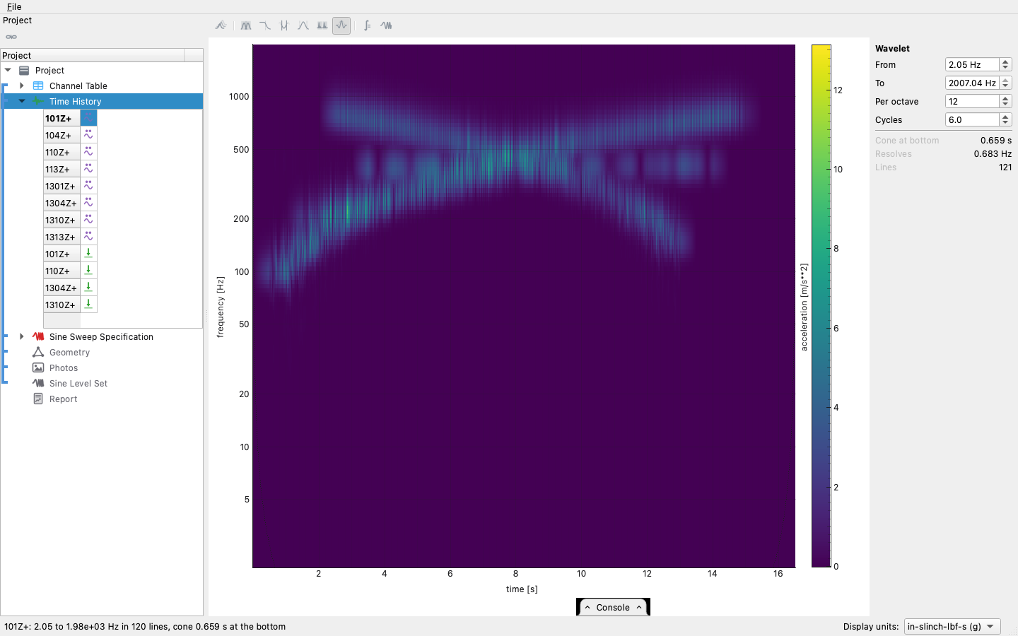
A PSD says what frequencies a record contains and says nothing about when. For a stationary run that is the whole truth. For everything else — a rattle that comes and goes, a shock's ring-down, a resonance a sweep excites on its way through — when is the story, and the spectrum has already averaged it away. The wavelet reading answers it: time across, frequency up a logarithmic axis, amplitude as colour — and in three dimensions, amplitude standing up out of the floor.
Where it lives
The wavelet button sits with the other readings of a time history — averaging, filter, truncate, kurtosis, shocks — one of which is on at a time. It opens in 3-D, because a scalogram is already a function of two variables and a surface is its natural form; the 2D/3D toggle stands it down to the flat picture above. In a report, the transient and shock templates carry the same figure, drawn from the same computation — for a shock it stands where a PSD would mislead, since a density's level depends on how much quiet air the recording holds.
From a script, the same reading is one call:
The panel
One record at a time — a scalogram is dense, and two side by side read as noise rather than as two answers. Which record is chosen the way it is everywhere else: in the project tree. Pick a record in the object's grid and the scalogram is of that record; select the object whole and it opens on the first record, with the tree settled onto it so the selection always says what the picture is of. The panel holds the three numbers the tree cannot:
- From / To — the frequency range. It defaults to everything the record can carry, from where the longest wavelets still fit inside the record up to just under Nyquist; the reading stays true to a fraction of a percent right against the top.
- Per octave — how finely the axis is drawn. The axis is logarithmic because a wavelet's bandwidth is a constant fraction of its frequency; twelve lines per octave draws a continuous-looking ridge without computing rows nobody can tell apart.
- Cycles — the trade itself. The transform slides a wave packet along the record; cycles is how many fit under its window. Few cycles resolve when and blur what; many resolve what and blur when. Six is the convention, and close to the least the mathematics permits.
The derived rows say what the settings imply before the transform runs — most importantly the cone, below.
What the picture can and cannot say
Three honest limits, each visible in the picture itself:
The cone of influence. A low-frequency wavelet is long, and near the record's ends it hangs off the edge — what it reads there is where the record was cut, not the article. The affected span is shaded (flat) or walled (3-D), widest at the bottom of the axis, because it looks exactly like data. A range whose bottom rows are all cone is a picture of the recording's edges; the panel warns before drawing one.
Amplitude is the record's own. A 2 g tone reads 2, wherever it sits on the frequency axis, so the colour bar carries the channel's units and a number can be read off the picture. (The other convention in the literature — unit energy — draws the same tone four times taller at 50 Hz than at 800; this toolset does not use it.)
Ridges that ripple are usually the record. Two tones passing within one wavelet's bandwidth of each other sum to an amplitude-modulated signal — exactly as they would through any filter that wide — and the ripple is at their difference frequency. Raising Cycles narrows the band and separates tones far enough apart; tones a hertz apart at hundreds of hertz are inseparable by any window short of one that erases the time axis, and their beat is the measurement. A single steady tone draws perfectly smooth, which is the test that the transform adds no ripple of its own.
When to reach for it
- A sweep — each tone's trajectory is a ridge, and crossings, dwells and resonances passed through are all legible at a glance (the sine workflow opens with it).
- A transient or a shock — what rang, and for how long after the event; the transient and shock reports carry the figure for exactly this.
- A record that fails kurtosis — the kurtosis bars say a channel has peaks its spectrum did not predict; the scalogram says when they happened and at what frequency, which is usually enough to name the rattle.
- Not a stationary random run — its whole story is in the PSD, and the scalogram will faithfully draw a texture with nothing in it.